


ROLE
UX Design, UX Research, UX Lead
DESIGN TEAM
Louis Moncouyoux, Michael Salmon, Jae Yoon, Kelly Bignell-Asedo, Lama Shehadeh, Ayca Ozkan, Guillaume Azadian
YEAR
BBH/Domani, 2017
BALANCING FUNCTION AND INSPIRATION
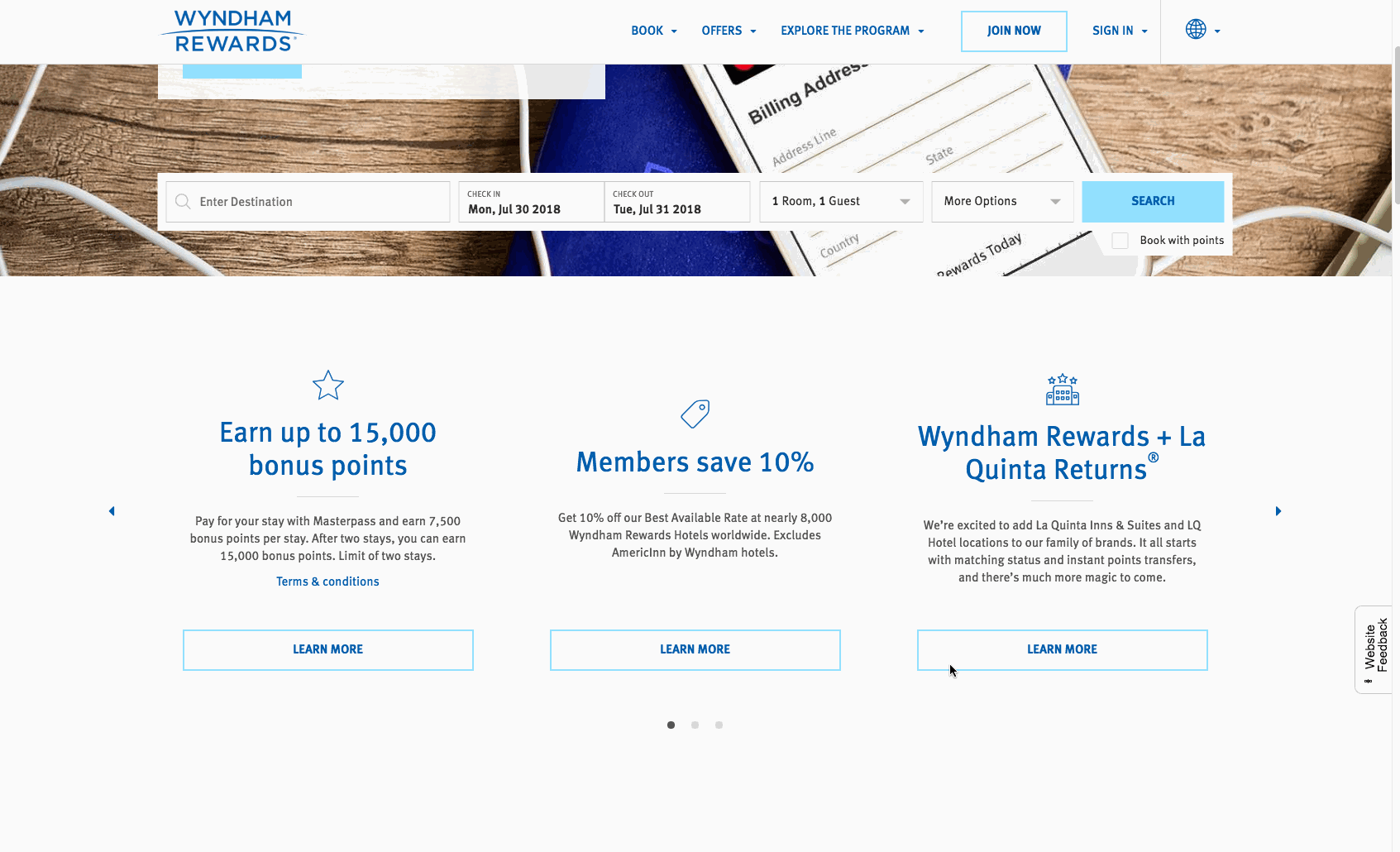
Wyndham Hotel Group (WHG) came to us to help them execute their Content and Creative Support Strategy for the Wyndham Rewards Digital Loyalty Project, which included a redesign of the Wyndham Rewards platform. We worked closely with the WHG digital team and Accenture throughout the project, working in 2-week sprints to complete the design.
Overall this project was very well received by their loyalty members, who were grateful to be able to now do everything that they could do on a laptop computer on their phones.
You can see the InVision prototype for the desktop experience here and the mobile experience here. The live site can also be seen here.
Educating the user on the loyalty experience
Aside from enhancing the look and feel of the loyalty site, one of our main goals was to ensure that the user truly understood the loyalty program.
Wyndham made it easy to earn and redeem points toward free nights and more. However, the key selling points were hidden behind the terms "go fast" "go free", "go get 'em". These terms are service marks that are pillars of the program’s positioning so that we couldn't remove or modify them. However, we could ensure that whenever the user encountered these terms, it was very clear what they actually got from each pillar.
Moreover, as we conducted our user research, we learned that many members of Wyndham Rewards booked the same day. With many of their properties being in cities and alongside highways, users were booking last-minute trips or staying for the night as they went on a road trip. Numerous users were also traveling for work and ranged from truckers to people going on a last-minute business meeting. These people were booking on the road or even in the parking lot! We needed to have an adaptive booking experience that worked for these users to ensure that they could find a place to stay near them right now.
We tested with users at multiple stages to ensure that the content was easily digestible and that the site overall was as inspiring as it was informative. We also tested the booking flow, ensuring that it aligned with the user’s needs for the scenarios corresponding to each breakpoint.
The site's relaunch was a success, and many of our solutions continue to be woven throughout the rest of their digital ecosystem.
Navigation on the desktop breakpoint

Navigation on the mobile breakpoint

Homepage

Enrollment flow

Screens from the enrollment experience

Screens from the account section

Onboarding experience on the live site
Evolving the search experience
After we redesigned the Wyndham Rewards experience, they came to us for a deeper dive into their search experience. Wyndham Worldwide has over 25,000 properties that their loyalty members can book a stay at but these guests only knew about their 8,000 hotels.
We focused on loyalty - the "Blue Thread" - to unite all of these disparate offerings. We positioned it as the primary connector between a customer’s vacation dream and an expansive selection of varied properties and experiences. However, we need to do more than tout the loyalty program to sell across all property types.
We had to inspire users by opening up the world of Wyndham properties to rewards members and get them excited about the prospect of redeeming their points for an unforgettable travel experience. The experience had to feel rich and well-considered so prospective guests are inclined to explore and return to the experience many times over. Lastly, the connection from search and browse to starting the redemption/booking flow needed to feel seamless.
We started the process by exploring the competitive landscape and auditing the current experience. Next, we took the data we had on the typical Wyndham Rewards member and created user stories to identify features for focus.


We then brainstormed numerous features that we could implement based on these stories and started the iterative process. We ran a series of sprints, user testing to ensure the optimal experience. Below are some examples of the output of this process.
You can see the InVision prototype for the desktop experience here and the mobile experience here.
Sampling of sketches

Screens from the search experience on desktop

Screens from the search results experience on desktop

Screens from the search results experience on mobile

Screens from the search results experience on mobile
