


ROLE
UX Design, UX Research, UX Lead
DESIGN TEAM
Guillaume Azadian, Louis Moncouyoux, Jae Yoon, Kelly Bignell-Asedo
YEAR
BBH/Domani, 2016-2017
REDESIGNING A CONTENT-RICH EXPERIENCE
Harvard Business School (HBS) has consistently attracted some of the brightest and most talented candidates from around the globe. Their Executive Education program, in particular, offers programs, professors, and experiences that are unrivaled within the academic world.
The business goal for redesign of the HBS Executive Education website was to create an elevated experience that would engage prospects to either 1) complete an application or 2) consume content about a program and, in that process, provide their contact information. There also was an opportunity for the site to engage alumni, capture their experiences, and encourage further interaction within the network.
Overall, this effort has been well received by prospective participants, alumni, and faculty. You may view the full site here.
Starting with stakeholders
We were excited to have the opportunity to redesign the HBS Executive Education website. We started our discovery phase with a series of two days of stakeholder and user interviews at Harvard, sitting in on classes to get the participant's full experience. We interviewed folks in the Marketing, Client Services, Core Leadership, Corporate Relations, Open Enrollment, PR, and HBS IT teams. This enabled us to gain a thorough understanding of the mission, get insights on various audiences, and comprehend their overall strategic goals. We heard a few key things:

From the stakeholder interviews, common themes emerged on how we could improve the site experience and exemplify the HBS Executive Education brand. Across the board, we heard the need to:
Emphasize key differentiators
Demystify the experience
Prove organizational ROI
Serve multiple audiences (Audience focus: 75% individuals / 15% custom / 10% organizations)
Improve program “findability”
Lead with powerful visuals
Streamline the application process
Increase quality and volume of applications
Meeting with these stakeholders also allowed us to define our main user types and use cases:

PROSPECTIVE PARTICIPANT (PRIMARY): A single individual who is looking to learn more about HBS Executive Education and its programs
INQUIRING ORGANIZATION (SECONDARY): A key decision maker at an organization who is looking to learn more about HBS Executive Education and the offerings for organizations/small teams
RETURNING ALUMNI (SECONDARY): A past participant who is looking to network, digest thought leadership pieces, or apply for another program
INTERNAL STAKEHOLDERS (TERTIARY): A member of the faculty or staff (likely in client services) who needs to reference a program quickly
CURRENT PARTICIPANT (TERTIARY): A participant who is currently in a program and needs to access on-campus resources
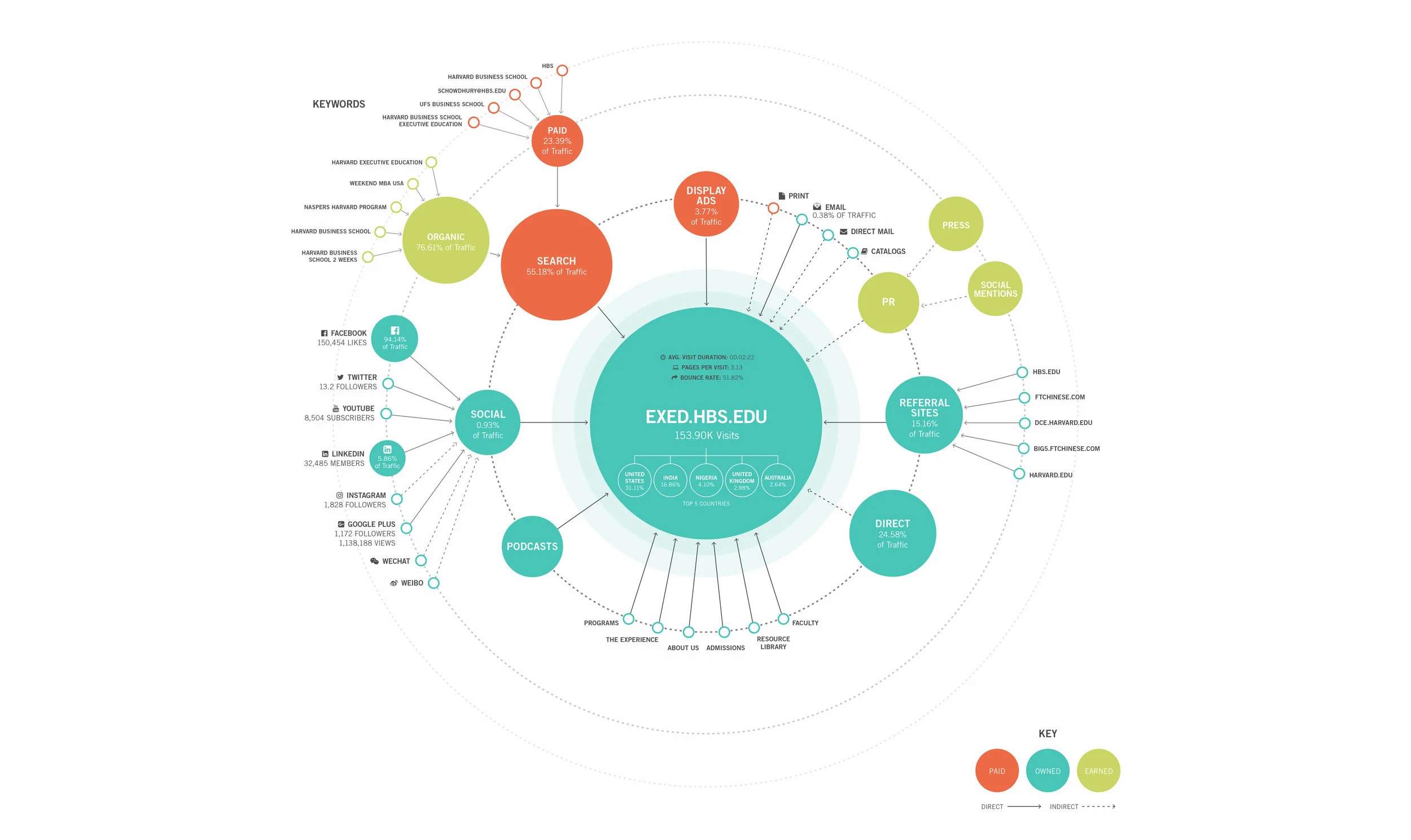
Exploring the ecosystem & competitive landscape
We knew that HBS wanted to highlight what makes them different. From a storytelling perspective, what set them apart was the campus experience (HBS is the only school where Executive Education has its own dedicated campus) and their educational philosophy (Harvard pioneered the case method).
However, it was important for us to understand the competitive landscape to really make HBS stand out.
In doing a competitive audit, we cast a wide net looking at:
TRADITIONAL COMPETITORS: Academic competitors, mainly in the U.S., who follow Harvard and try to emulate offerings. (e.g., Wharton, Stanford, University of Chicago Booth, Columbia University, Kellogg)
GLOBAL COMPETITORS: Dedicated Executive Education offerings, mainly abroad, that tout a global perspective and technological expertise. (e.g., INSEAD, IMD, IESE)
EMERGING PLAYERS: Leadership development offerings from companies that once seemed complementary but are now trying to get into the high-margin Executive Education field. (e.g., McKinsey, Boston Consulting Group, Bain & Company)

We found that our competitors were doing a better job at differentiating their programs, utilizing big imagery to tell their story, and leveraging intuitive navigation to direct applicants to the right program.
We also mapped out their digital ecosystem as it was important for us to have an understanding of how traffic was coming in and out of the site if we were to assist in lead generation.
Navigating 120+ pages of content
We started work on the redesign by looking at the navigation. We audited each main page type on the site to understand how to restructure and where we could consolidate.
As it was important for the navigation to align with the prospects vernacular, we also audited a even wider pool of competitors to understand the typical structure and nomenclature. Moreover, the Executive Education site had to maintain the main Harvard Business School navigation, so we knew we had to keep our navigation as simple as possible.
Navigation before & after

While we still have the same number of navigational items, we have taken some of the mystery out of the experience with clear labels that align with what the prospect would like to see and expect to see. We also have optimized the site to serve multiple audiences with clear sections for people who are taking a program as an individual versus an organization that is looking to educate and train its employees.
The site map is as follows (see the full site map here):

Diving into the screens
The primary user we were designing for was the prospective participant. It was important for us to highlight what makes Harvard Executive Education unique. We had to shed the perception of being intimidating and traditional and position the program as forward-thinking.
We did this by bringing people forward. We highlighted groundbreaking research, thinking, and real-world expertise from the faculty. We also celebrated the community that revolves around the program, namely the vast alumni network and global reach of current and past participants. Lastly, we looked for ways to bring the full campus experience to life by leading with immersive imagery, incorporating interactive polls, and demonstrating the living groups’ experience.
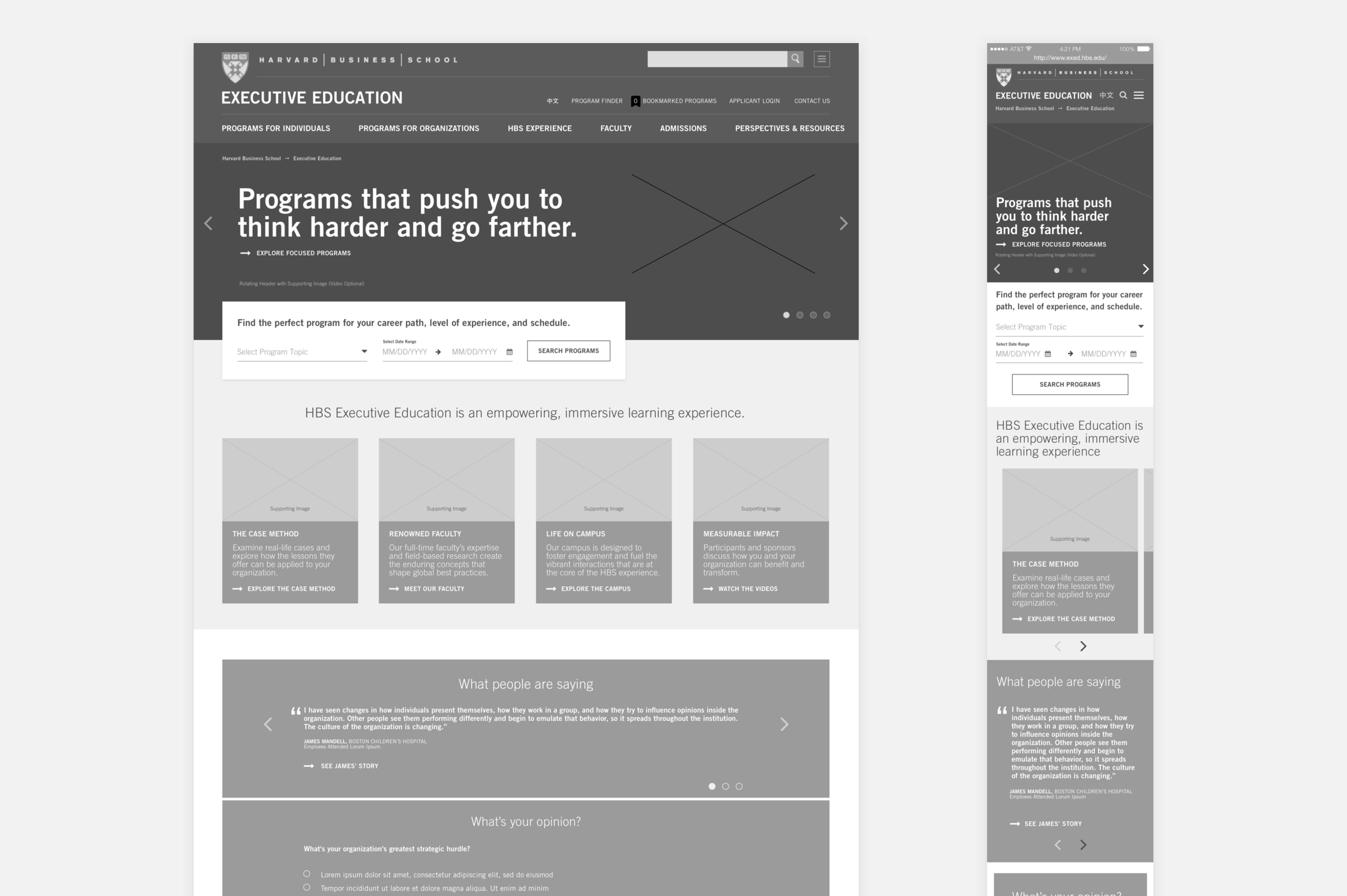
We also learned that given the weight of this decision, prospective participants and organizations are most likely to use their desktop computers to explore the site and apply. Therefore, we lead with a desktop-first design that supported an easy mobile search experience for quick find + reference on the go.
Homepage at desktop & mobile breakpoints
Finding and applying for the right program
One of the features the site had before we redesigned it was a Program Finder. However, we learned from stakeholders and prospects that the existing Program Finder wasn’t great at finding the right program for potential applicants. It often returned too many results or results that aren’t relevant to a prospect’s needs. This issue was partly due to their backend and the user experience but also representative of a legacy way of thinking about how to tag results.
In evolving the Program Finder, we looked for ways to prioritize the user’s experience to ensure that prospects can find what they’re looking for based on familiar wording.
We also looked to address some key issues within the application process, namely:
Applicants start and stop the application because they’re unaware of the information they’ll need to have close at hand to complete the application
The application doesn’t indicate how long it takes to complete up front (Approx. 90 minutes)
The application process and review timeline is unclear, prompting many applicants to become frustrated and contact Client Services for an update
Users with in-progress applications don’t know how to return to the application to complete it
We looked at the application process and adjusted the experience to be easier to navigate and have greater transparency.
Then, we went up to Harvard to test with past, current, and prospective participants.
We ran two rounds of in-person user tests across desktop and mobile breakpoints, iterating in between. We aimed to determine if the navigation labels were clear, if the programs were easy to find, if the programs were easy to compare, and if the application was easier to complete.
At a high level, we learned that:
Users appreciated the testimonials in context
Users are unfamiliar with internal program categorization
Mobile testers felt pages were very long and they had to scroll a lot.
Mobile testers had a hard time accessing secondary and tertiary pages.
Mobile testers expressed that while they mostly access the site via desktop or tablet, they have used their mobile devices for quick reference or to access program info on the go.

We made adjustments based on these testing findings, particularly looking for ways to make the mobile experience easier and faster to navigate even with an extremely copy-heavy site.
We have not received any quantitive numbers from Harvard Business School’s Executive Education program on how this site has performed. However, we have received positive feedback both from stakeholders and participants that programs are easier to find and compare.
Screens from the Program Finder on the desktop breakpoint

Screens from the Comparison Tool on the desktop breakpoint

Screens from the Program Finder & Comparison Tool on the mobile breakpoint

Select screens from the application flow

